Ligature fonts for R

Ligature fonts are fonts which sometimes map multiple characters to a single glyph, either for readability or just because it looks neat. Importantly, this only affects the rendering of the text with said font, while the distinct characters remain in the source.

Screen Shot 2017-07-19 at 20.39.24

The Apple Chancery font with and without ligatures enabled.

Maybe ligatures are an interesting topic in themselves if you’re into typography, but it’s the relatively modern monospaced variants which are significantly more useful in the context of R programming.

Two of the most popular fonts in this category are:

  • Fira Code — an extension of Fira Mono which really goes all out providing a wide range of ligatures for obscure Haskell operators, as well as the more standard set which will be used when writing R
  • Hasklig — a fork of Source Code Pro (in my opinion a nicer base font) which is more conservative with the ligatures it introduces

Here’s some code to try out with these ligature fonts, first rendered via bog-standard monospace font:

library(magrittr)
library(tidyverse)

filtered_storms <- dplyr::storms %>%
  filter(category == 5, year &amp;gt;= 2000) %>%
  unite("date", year:day, sep = "-") %>%
  group_by(name) %>%
  filter(pressure == max(pressure)) %>%
  mutate(date = as.Date(date)) %>%
  arrange(desc(date)) %>%
  ungroup() %T>%
  print()

Here’s the same code rendered with Hasklig:

hasklig.png

Some of the glyphs on show here are:

  • A single arrow glyph for less-than hyphen (<-)
  • Altered spacing around two colons (::)
  • Joined up double-equals

Fira Code takes this a bit further and also converts >= to a single glyph:

fira_code

In my opinion these fonts are a nice and clear way of reading and writing R. In particular the single arrow glyph harks back to the APL keyboards with real arrow keys, for which our modern two-character <- is a poor substitute.

One downside could be a bit of confusion when showing your IDE to someone else, or maybe writing slightly longer lines than it appears, but personally I’m a fan and my RStudio is now in Hasklig.

2 Comments

Filed under R

The Mandelbrot Set in R

The Mandelbrot set is iconic and countless beautiful visualisations have been born from its deceptively simple recursive equation. R’s plotting ecosystem should be the perfect setting for generating these eye-catching visualisations, but to date the package support has been lacking.

Googling for Mandelbrot set implementations in R didn’t immediately strike pay dirt — for sure there are a few scripts and maybe one dusty package out there but nothing definitive. One of the more useful search results was an age-old academic’s page (presumably pre-dating CSS) with a zip archive of an R wrapper around a C implementation of a Mandelbrot set generator. What’s more, the accompanying README bore the epitaph:

Eventually, perhaps in 50 years or so, I’ll put everything together in a
proper R package.

—a siren song to any R developer with too much time on their hands!

lava_cardoid_bulb

Expect a few of these plots in this post (view in shiny)

Mandelbrot R package

The first output was an R package, mandelbrot, which re-wraps the original C code by Mario dos Reis. This provides two interfaces to the underlying set generation algorithm:

  • mandelbrot() for generating an object for use with base R image
  • mandelbrot0() for generating a tidy data.frame for use with ggplot2 (equivalent to as.data.frame(mandelbrot()) but faster)

It also has a few other helper functions and utilities (see the docs for info). One of the examples in the README reuses a weird uneven palette made for a previous blog post to pretty good effect:

library(ggplot2)

mb <- mandelbrot(xlim = c(-0.8335, -0.8325),
                 ylim = c(0.205, 0.206),
                 resolution = 1200L,
                 iterations = 1000)

# vaccination heatmap palette
cols <- c(
  colorRampPalette(c("#e7f0fa", "#c9e2f6", "#95cbee",
                     "#0099dc", "#4ab04a", "#ffd73e"))(10),
  colorRampPalette(c("#eec73a", "#e29421", "#e29421",
                     "#f05336","#ce472e"), bias=2)(90),
  "black")

df <- as.data.frame(mb)
ggplot(df, aes(x = x, y = y, fill = value)) +
  geom_raster(interpolate = TRUE) + theme_void() +
  scale_fill_gradientn(colours = cols, guide = "none")

README-ggplot-1

This is great for single views, but you pretty quickly want to explore and zoom interactively. Mario dos Reis and Jason Turner (via r-help) implemented this in R using locator to read the cursor position and zoom. 14 years ago that was a pretty neat solution but today we can take this idea a bit further with the R web framework Shiny.

Shinybrot Shiny app

Shinybrot is a pretty simple Shiny app for exploring views generated by the mandelbrot package. It uses “brushing” for plot interaction, allowing the user to drag a rectangle selection which is then set to the x and y limits for the subsequent plot. This can be recursed to go deeper and deeper into the fractal and to get some appreciation of the set complexity.

grid_lines

Not sure why this happens…

Eventually when you go deep enough you bump up against some ggplot2 hard limit where the view is obscured by mysterious white grid lines. (Hadley points out that these aren’t grid lines but gaps between tiles — I think a problem that comes with approaching the limits of R’s numeric precision.) Still, you’re good for a fair few recursions.

Parameters from URI query string

seahorse_spec

Seahorse valley (view in shiny)

One feature I wanted was static URIs which resolve to a given view. For example, if you want to link to some tiny but interesting region of “Seahorse Valley” (the crevasse between the two primary bulbs), you should be able to direct link to the view you’re looking at.

As usual, Shiny has great support for this out of the box. parsedQueryString parses URI params in the form /?param=value to a named list. Then, as parameters change they can be pushed back to the user’s address bar using updateQueryString. Using mode = "push" with updateQueryString pushes the parameterised URI to the browser’s history stack, meaning users get working forward and back buttons for free!

Try it out in the shinyapps hosted version:

Screen Shot 2017-06-27 at 23.23.07

The shinybrot app, view at shinyapps.io or serve locally with shiny::runGitHub("blmoore/shinybrot")

ToDo

Possible extensions would be Julia sets and maybe even more exotic fractal equations (Newton fractals, magnetic fractals, Beasley ferns?). Apparently there are also some reasonably straightforward optimisations to the Mandelbrot set algorithm, for example shortcuts for blocking out the primary bulbs rather than iterating over each point, however the simple existing C code Mario put together is already blazingly fast, to the point where generating a view is mostly rasterisation-bound rather than from performing the set calculations.

Code

Issues and pull requests welcome:


After speaking to the author it turns out he did recently get around to packaging his code, see mariodosreis/fractal

Leave a comment

Filed under R, R package

Interactive charts in R

I’m giving a talk tomorrow at the Edinburgh R usergroup (EdinbR) on how to get started building interactive charts in R. I’ll talk about rCharts as a great general entry point to quickly generating interactive charts, and also the newer htmlwidgets movement, allowing interactive charts to be more easily integrated with RMarkdown and Shiny. I also tried to throw in a decent amount of Edinburgh-related examples along the way.

Current slides are here:

Click through for HTML slide deck.

Click through for HTML slide deck.

I’ve since spun out what started as a simple example for the talk into a live web app, viewable at blackspot.org.uk. Here I’m looking at Edinburgh Open Data from the county council of vehicle collisions in the city. It’s still under development and will be my first real project in Shiny, but already has started to come together quite nicely.

blackspot Shiny web app. Code available on github.

Blackspot Shiny web app. Code available on github. NB. The UI currently retains a lot of code borrowed from Joe Cheng’s beautiful SuperZip shiny example.

The other speaker for the session is Alastair Kerr (head of bioinformatics at the Wellcome Trust Centre for Cell Biology here in Edinburgh), and he’ll be giving a beginner’s guide to the Shiny web framework. All in all it should be a great meeting, if you’re nearby do come along!

2 Comments

Filed under R

Recreating the vaccination heatmaps in R

In February the WSJ graphics team put together a series of interactive visualisations on the impact of vaccination that blew up on twitter and facebook, and were roundly lauded as great-looking and effective dataviz. Some of these had enough data available to look particularly good, such as for the measles vaccine:

Credit to the WSJ and creators: Tynan DeBold and Dov Friedman

Credit to the WSJ and creators: Tynan DeBold and Dov Friedman

How hard would it be to recreate an R version?

Base R version

Quite recently Mick Watson, a computational biologist based here in Edinburgh, put together a base R version of this figure using heatmap.2 from the gplots package.

If you’re interested in the code for this, I suggest you check out his blog post where he walks the reader through creating the figure, beginning from heatmap defaults.

However, it didn’t take long for someone to pipe up asking for a ggplot2 version (3 minutes in fact…) and that’s my preference too, so I decided to have a go at putting one together.

ggplot2 version

Thankfully the hard work of tracking down the data had already been done for me, to get at it follow these steps:

  1. Register and login to “Project Tycho
  2. Go to level 1 data, then Search and retrieve data
  3. Now change a couple of options: geographic level := state; disease outcome := incidence
  4. Add all states (highlight all at once with Ctrl+A (or Cmd+A on Macs)
  5. Hit submit and scroll down to Click here to download results to excel
  6. Open in excel and export to CSV

Simple right!

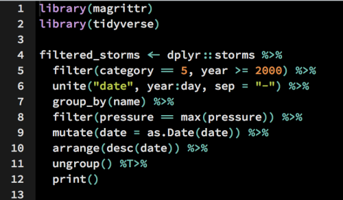
Now all that’s left to do is a bit of tidying. The data comes in wide format, so can be melted to our ggplot2-friendly long format with:

measles <- melt(measles, id.var=c("YEAR", "WEEK"))

After that we can clean up the column names and use dplyr to aggregate weekly incidence rates into an annual measure:

colnames(measles) <- c("year", "week", "state", "cases")
mdf <- measles %>% group_by(state, year) %>% 
       summarise(c=if(all(is.na(cases))) NA else 
                 sum(cases, na.rm=T))
mdf$state <- factor(mdf$state, levels=rev(levels(mdf$state)))

It’s a bit crude but what I’m doing is summing the weekly incidence rates and leaving NAs if there’s no data for a whole year. This seems to match what’s been done in the WSJ article, though a more intepretable method could be something like average weekly incidence, as used by Robert Allison in his SAS version.

After trying to match colours via the OS X utility “digital colour meter” without much success, I instead grabbed the colours and breaks from the original plot’s javascript to make them as close as possible.

In full, the actual ggplot2 command took a fair bit of tweaking:

ggplot(mdf, aes(y=state, x=year, fill=c)) + 
  geom_tile(colour="white", linewidth=2, 
            width=.9, height=.9) + theme_minimal() +
    scale_fill_gradientn(colours=cols, limits=c(0, 4000),
                        breaks=seq(0, 4e3, by=1e3), 
                        na.value=rgb(246, 246, 246, max=255),
                        labels=c("0k", "1k", "2k", "3k", "4k"),
                        guide=guide_colourbar(ticks=T, nbin=50,
                               barheight=.5, label=T, 
                               barwidth=10)) +
  scale_x_continuous(expand=c(0,0), 
                     breaks=seq(1930, 2010, by=10)) +
  geom_segment(x=1963, xend=1963, y=0, yend=51.5, size=.9) +
  labs(x="", y="", fill="") +
  ggtitle("Measles") +
  theme(legend.position=c(.5, -.13),
        legend.direction="horizontal",
        legend.text=element_text(colour="grey20"),
        plot.margin=grid::unit(c(.5,.5,1.5,.5), "cm"),
        axis.text.y=element_text(size=6, family="Helvetica", 
                                 hjust=1),
        axis.text.x=element_text(size=8),
        axis.ticks.y=element_blank(),
        panel.grid=element_blank(),
        title=element_text(hjust=-.07, face="bold", vjust=1, 
                           family="Helvetica"),
        text=element_text(family="URWHelvetica")) +
  annotate("text", label="Vaccine introduced", x=1963, y=53, 
           vjust=1, hjust=0, size=I(3), family="Helvetica")

Result

measles_incidence_heatmap_2I’m pretty happy with the outcome but there are a few differences: the ordering is out (someone pointed out the original is ordered by two letter code rather than full state name) and the fonts are off (as far as I can tell they use “Whitney ScreenSmart” among others).

Obviously the original is an interactive chart which works great with this data. It turns out it was built with the highcharts library, which actually has R bindings via the rCharts package, so in theory the original chart could be entirely recreated in R! However, for now at least, that’ll be left as an exercise for the reader…


Full code to reproduce this graphic is on github.

22 Comments

Filed under R

Planning an R usergroup meeting in R

The edinbr_logoEdinburgh R usergroup (EdinbR) put together a survey a while back to figure out some of the logistical details for organising a succesful meeting. We had 75 responses (and a few more after I grabbed the results) so here’s some quick analysis, all done in R of course. The code and data for these figures are available on the EdinbR github account.

Who’s coming to EdinbR meetings?

attendance

It looks like the majority of our audience would describe themselves as having an “intermediate” level of R knowledge, but there’s a good number of beginners too. The overall number of attendees is promising: 43 said they’d attend either every meeting or most meetings!

When’s the best time and day for meetings?

best_day

best_time

Together the results for the best time and day were potentially biased by our very first meeting (which happened at Wednesday 5pm)…

best_time_combo

Regardless this result means we’ll stick with Wednesdays at 5pm for now, without prejudice against lunchtime sessions in the future.

Where should meetings be held?

venues

Again strong support for the status quo: George square (and Bristo square, informatics etc.) are nice, central locations which are ideal for those based in the city centre and a decent compromise for those further afield, such as EdinbR attendees from the IGMM or King’s Buildings.

What do we want to hear about?

The organisers had already put together a  very non-comprehensive list of potential topics for future meetings and so we asked respondents to select those they were interested in hearing about:

popular_topics

This gives a rough roadmap for upcoming EdinbR meetings: if you could give a talk about any of the above topics then do let us know; you can reach me by email or on twitter, and do join our mailing list to be notified of our next meeting!

This post is mirrored on edinbr.org

2 Comments

Filed under R

EdinbR: A new R usergroup for Edinburgh

Inspired by succesful RUGs like LondonR and CambR, I’m pleased to announce a new R usergroup for those in and around Edinburgh: EdinbR!

edinbr_logo
Edinburgh has a large research community using R, spread across different campuses and even universities so a centralised discussion group is long overdue. Many R packages have been developed by Edinburgh researchers, ranging from general parallelisation packages (SPRINT) to highly-specific packages targetting cutting-edge genomics data (poRe). It seems like a great idea to get these people talking to each other: developers, users and interested newbies alike!

So without further ado, the details for our first meeting are:

  • Date: Wednesday 17:00 18th February 2015
  • Venue: Room S1, 7 George Square Psychology building, Edinburgh
  • Topics: Refining plans for meeting format, timing, venues; selecting speakers for future meetings; advertising meetings, etc.

All are welcome regardless of R experience. We hope to run a range of meetings with some aimed at general or beginner topics and others delving more deeply into advanced areas.

If you might be interested in attending, we have a mailing list where meetings will be advertised, we’re on twitter (@edinb_r) and you can email the organisers at info@edinbr.org.

We hope to see you there!

Leave a comment

Filed under R

Hollywood action heroes

I’ve taken a look at the movie careers of a few of the most famous Hollywood action stars: Arnie, Sly Stallone, Bruce Willis and lots more, both older and more modern. The analysis and write-up is hosted on my new website, so that I can embed the interactive charts and make use of javascript.

Incomplete overview of Arnold Schwarzenegger's movie career.

Overview of Arnold Schwarzenegger’s movie career.

If you’re interested in seeing the full post, check it out!

2 Comments

Filed under Uncategorized

Celebrity twitter followers by gender

The most popular accounts on twitter have millions of followers, but what are their demographics like? Twitter doesn’t collect or release this kind of information, and even things like name and location are only voluntarily added to people’s profiles. Unlike Google+ and Facebook, twitter has no real name policy, they don’t care what you call yourself, because they can still divine out useful information from your account activity.

For example, you can optionally set your location on your twitter profile. Should you choose not to, twitter can still just geolocate your IP. If you use an anonymiser or VPN, they could use the timing of your account activity to infer a timezone. This could then be refined to a city or town using the topics you tweet about and the locations of friends and services you mention most.

I chose to look at one small aspect of demographics: gender, and used a cheap heuristic based on stated first name to estimate the male:female ratios in a sample of followers from these very popular accounts.

Top 100 twitter accounts by followers

A top 100 list is made available by Twitter Counter. It’s not clear that they have made this list available through their API, but thanks to the markup, a quick hack is to scrape the usernames using RCurl and some regex:

require("RCurl")
top.100 <- getURL("http://twittercounter.com/pages/100")

# split into lines
top.100 <- unlist(strsplit(top.100, "\n"))
# Get only those lines with an @
top.100 <- top.100[sapply(top.100, grepl, pattern="@")]

# Grep out anchored usernames: <a ...>@username</a>
top.100 <- gsub(".*>@(.+)<.*", "\\1", top.100)[2:101]
head(top.100)
# [1] "katyperry"  "justinbieber"  "BarackObama"  ...

R package twitteR

Getting data from the twitter API is made simple by the twitteR package. I made use of Dave Tang’s worked example for the initial OAuth setup, once that’s complete the twitteR package is really easy to use.

The difficulty getting data from the API, as ever, is to do with rate limits. Twitter allows 15 requests for follower information per 15 minute window. (Number of followers can be queried by a much more generous 180 requests per window.) This means that to get a sample of followers for each of the top 100 twitter accounts, it’ll take at a minimum 1 hour 40 mins to stay on the right side of the rate limit. I ended up using 90 second sleep windows between requests to be safe, making a total query time of two and a half hours!

Another issue is possibly to do with strange characters being returned and breaking the JSON import. This error crops up a lot and meant that I had to lower the sample size of followers to avoid including these problem accounts. After some highly unscientific tests, I settled on about 1000 followers per account which seemed a good trade-off between maximising sample size but minimising failure rate.

# Try to sample 3000 followers for a user:
username$getFollowers(n=3000)
# Error in twFromJSON(out) :
#  Error: Malformed response from server, was not JSON.
# The most likely cause of this error is Twitter returning
# a character which can't be properly parsed by R. Generally
# the only remedy is to wait long enough for the offending
# character to disappear from searches.

Gender inference

Here I used a relatively new R package, rOpenSci’s gender (kudos for resisting gendR and the like). This uses U.S. social security data to probabilistically link first names with genders, e.g.:

devtools::install_github("ropensci/gender")
require("gender")
gender("ben")
#   name proportion_male proportion_female gender
# 1  ben          0.9962            0.0038   male

So chances are good that I’m male. But the package also returns proportional data based on the frequency of appearances in the SSA database. Naively these can be interpreted as the probability a given name is either male or female. So in terms of converting a list of 1000 first names to genders, there are a few options:

  1. Threshold: if  >.98 male or female, assign gender, else ignore.
  2. Probabilistically: use random number generation to assign each case, if a name is .95 male and .05 female, on average assign that name to females 5% of the time.
  3. Bayesian-ish: threshold for almost certain genders (e.g. .99+) and use this as a prior belief of gender ratios when assigning gender to the other followers for a given user. This would probably lower bias when working with heavily skewed accounts.

I went with #2 here. Anecdotal evidence suggests it’s reasonably accurate anyway, with twitter analytics (using bag of words, sentiment analysis and all sorts of clever tricks to unearth gender) estimating my account has 83% male followers (!), with probabilistic first name assignment estimating 79% (and that’s with a smaller sample). Method #3 may correct this further but the implementation tripped me up.

Results

Celebrity twitter followers by gender

So boys prefer football (soccer) and girls prefer One Direction, who knew? Interestingly Barack Obama appears to have a more male following (59%), as does Bill Gates with 67%.

At the other end of the spectrum, below One Direction, Simon Cowell is a hit with predominantly female twitter users (70%), as is Kanye West (67%) and Khloe Kardashian (72%).

Another surprise is that Justin Bieber, famed as teen girl heartthrob, actually has a more broad gender appeal with 41 / 59 male-female split.

Interactive charts

Click for an interactive version.

Click for an interactive version.

Using the fantastic rCharts library, I’ve put together some interactive graphics that let you explore the above results further. These use the NVD3 graphing library, as opposed to my previous effort which used dimple.js.

The first of these is ordered by number of followers, and the second by gender split. The eagle-eyed among you will see that one account from the top 100 is missing from all these charts due to the JSON error I discuss above, thankfully it’s a boring one (sorry @TwitPic).

Where would your account be on these graphs? Somehow I end up alongside Wayne Rooney in terms of gender diversity :s

Caveats

  • A lot of the time genders can’t be called from an account’s first name. Maybe they haven’t given a first name, maybe it’s a business account or some pretty unicode symbols, maybe it’s a spammy egg account. This means my realised sample size is <<1000, sometimes the majority of usernames had no gender (e.g. @UberSoc, fake followers?).

    This (big) chart includes % for those that couldn't be assigned (NA)

    This (big) chart includes % for those that couldn’t be assigned (NA)

  • The SSA data is heavily biased towards Western (esp. US) and non-English names are likely to not be assigned a gender throughout. This is a shame, if you know of a more international gender DB please let me know.
  • I’m sampling most recent followers, so maybe accounts like Justin Bieber have a much higher female ratio in earlier followers than those which have only just hit the follow button.
  • The sample size of 1000 followers per account is smaller than I’d like, especially for accounts with 50 million followers.

If you have other ideas of what to do with demographics data, or have noticed additional caveats of this study, please let me know in the comments!


Full code to reproduce this analysis is available on Github.

21 Comments

Filed under R, Unrelated

What are the most overrated films?

“Overrated” and “underrated” are slippery terms to try to quantify. An interesting way of looking at this, I thought, would be to compare the reviews of film critics with those of Joe Public, reasoning that a film which is roundly-lauded by the Hollywood press but proved disappointing for the real audience would be “overrated” and vice versa.

To get some data for this I turned to the most prominent review aggregator: Rotten Tomatoes. All this analysis was done in the R programming language, and full code to reproduce it will be attached at the end.

Rotten Tomatoes API

This API is nicely documented, easy to access and permissive with rate limits, as well as being cripplingly restrictive in what data is presents. Want a list of all films in the database? Nope. Most reviewed? Top rated? Highest box-office takings? Nope.

The related forum is full of what seem like simple requests that should be available through the API but aren’t: top 100 lists? Search using mulitple IDs at once? Get audience reviews? All are unanswered or not currently implemented.

So the starting point (a big list of films) is actually kinda hard to get at. The Rube Golbergian method I eventually used was this:

  1. Get the “Top Rentals” list of movie details (max: 50)
  2. Search each one for “Similar films” (max: 5)
  3. Get the unique film IDs from step 2 and iterate

(N.B. This wasn’t my idea but one from a post in the API forums, unfortunately didn’t save the link.)

In theory this grows your set of films at a reasonable pace, but in reality the number of unique films being returned was significantly lower (shown below). I guess this was due to pulling in “walled gardens” to my dataset, e.g. if a Harry Potter film was hit, each further round would pull in the 5 other films as most similar.

Films returned

Results

Here’s an overview of the critic and audience scores I collected through the Rotten Tomatoes API, with some outliers labelled.

Most over- and underrated films

On the whole it should be noted that critics and audience agree most of the time, as shown by the Pearson correlation coefficient between the two scores (0.71 across >1200 films).

Click for interactive version.

Update:

I’ve put together an interactive version of the same plot here using the rCharts R package. It’ll show film title and review scores when you hover over a point so you know what you’re looking at. Also I’ve more than doubled the size of the film dataset by repeating the above method for a couple more iterations — take a look!

Most underrated films

Using our earlier definition it’s easy to build a table of those films where the audience ending up really liking a film that was panned by critics.

Scores are shown out of 100 for both aggregated critics and members of Rotten Tomatoes.

Scores are shown out of 100 for both aggregated critics and members of Rotten Tomatoes.

Somewhat surprisingly, the top of the table is Facing the Giants (2006), an evangelical Christian film. I guess non-Christians might have stayed away, and presumably it struck a chord within its target demographic — but after watching the trailer, I’d probably agree with the critics on this one.

This showed that some weighting of the difference might be needed, at the very least weighting by number of reviews, but the Rotten Tomatoes API doesn’t provide that data.

In addition the Rotten Tomatoes page for the film, shows a “want to see” percentage, rather than an audience score. This came up a few times and I’ve seen no explanation for it, presumably “want to see” rating is for unreleased films, but the API returns a separate (and undisclosed?) audience score for these films also.

Above shows a "want to see" rating, different to the "liked it" rating returned by the API and shown below

Above shows a “want to see” rating, different to the “liked it” rating returned by the API and shown below. Note: these screenshots from RottenTomatoes.com are not CC licensed and is shown here under a claim of Fair Use, reproduced for comment/criticism.

Looking over the rest of the table, it seems the public is more fond of gross-out or slapstick comedies (such as Diary of a Mad Black Woman (2005), Grandma’s boy (2006)) than the critics. Again, not films I’d jump to defend as underrated. Bad Boys II however…

Most overrated films

Here we’re looking at those films which the critics loved, but paying audiences were then less enthused.

As before, scores are out of 100 and they're ranked by difference between audience and critic scores.

As before, scores are out of 100 and they’re ranked by difference between audience and critic scores.

Strangely the top 15 (by difference) contains both the original 2001 Spy Kids and the sequel Spy Kids 2: The Island of Lost Dreams (2002). What did critics see in these films that the public didn’t? A possibility is bias in the audience reviews collected, the target audience is young children for these films and they probably are underrepresented amongst Rotten Tomatoes reviewers. Maybe there’s even an enrichment for disgruntled parent chaperones.

Thankfully, though, in this table there’s the type of film we might more associate with being “overrated” by critics. Momma’s Man (2008) is an indie drama debuted at the 26th Torino Film Festival. Essential Killing is a 2010 drama and political thriller from Polish director and screenwriter Jerzy Skolimowski. 

There’s also a smattering of Rom-Coms (Friends with Money (2006), Splash (1984)) — if the API returned genre information it would be interesting to look for overall trends but, alas. Additional interesting variables to consider might be budget, the lead, reviews of producer’s previous films… There’s a lot of scope for interesting analysis here but it’s currently just not possible with the Rotten Tomatoes API.

 Caveats / Extensions

The full code will be posted below, so if you want to do a better job with this analysis, please do so and send me a link! 🙂

  • Difference is too simple a metric. A better measure might be weighted by (e.g.) critic ranking. A film critics give 95% but audiences 75% might be more interesting than the same points difference between a 60/40 rated film.
  • There’s something akin to a “founder effect” of my initial chosen films that makes it had to diversify the dataset, especially to films from previous decades and classics.
  • The Rotten Tomatoes API provides an IMDB id for cross-referencing, maybe that’s a path to getting more data and building a better film list.
Full code to reproduce analysis

Note: If you’re viewing this on r-bloggers, you may need to visit the Benomics version to see the attached gist.


library("RCurl")
library("jsonlite")
library("ggplot2")
library("RColorBrewer")
library("scales")
library("gridExtra")
api.key <- "yourAPIkey"
rt <- getURI(paste0("http://api.rottentomatoes.com/api/public/v1.0/lists/dvds/top_rentals.json?apikey=&quot;, api.key, "&limit=50"))
rt <- fromJSON(rt)
title <- rt$movies$title
critics <- rt$movies$ratings$critics_score
audience <- rt$movies$ratings$audience_score
df <- data.frame(title=title, critic.score=critics,
audience.score=audience)
# Top 50 rentals, max returnable
ggplot(df, aes(x=critic.score, y=audience.score)) +
geom_text(aes(label=title, col=1/(critic.score – audience.score)))
# how can we get more? similar chaining
# STILL at most 5 per film (sigh)
getRatings <- function(id){
sim.1 <- getURI(paste0("http://api.rottentomatoes.com/api/public/v1.0/movies/&quot;,
id, "/similar.json?apikey=",
api.key, "&limit=5"))
sim <- fromJSON(sim.1)
#cat(sim$movies$title)
d <- data.frame(id = sim$movies$id,
title = sim$movies$title,
crit = sim$movies$ratings$critics_score,
aud = sim$movies$ratings$audience_score)
return(d)
}
rt.results <- function(idlist){
r <- sapply(unique(as.character(idlist)), getRatings, simplify=F)
r <- do.call(rbind, r)
return(r)
}
# Maybe this could be done via a cool recursion using Recall
r1 <- rt.results(rt$movies$id)
r2 <- rt.results(r1$id)
r3 <- rt.results(r2$id)
r4 <- rt.results(r3$id)
r5 <- rt.results(r4$id)
r6 <- rt.results(r5$id)
r7 <- rt.results(r6$id)
f <- function(x)
(5**x)-1
# Fig. 1: Number of films gathered via recursive descent
# of 'similar films' lists.
dev.off()
options(scipen=99)
pdf(4, 4, file="rottenTomatoHits.pdf")
par(cex.axis=.7, pch=20, mar=c(4,3,1,1), mgp=c(1.5,.3,0), tck=-.02)
plot(1:7, f(1:7), type="b", xlab="Recursions", ylab="Number of hits",
log="y", col=muted("blue"), lwd=2, ylim=c(4, 1e5))
lines(1:7, c(nrow(r1), nrow(r2), nrow(r3), nrow(r4), nrow(r5),
nrow(r6), nrow(r7)), type="b", col=muted("red"), lwd=2)
legend("bottomright", col=c(muted("blue"), muted("red")), pch=20, lwd=2,
legend=c(expression(Max~(5^x)), "Realised"), bty="n", lty="47")
dev.off()
r <- rbind(r1, r2, r3, r4, r5, r6, r7)
# 1279 unique films
ru <- r[!duplicated(as.character(r$id)),]
# Films with insufficient critics reviews get -1 score
ru[which(ru$crit == -1),]
ru <- ru[ru$crit != -1,]
ru$diff <- ru$crit – ru$aud
pcc <- cor(ru$crit, ru$aud)
# Overview figure: Show all critics vs. audience scores
# and highlight the titles of outliers
svg(7, 6, file="overview.svg")
ggplot(ru, aes(x=crit, y=aud, col=diff)) +
geom_point() +
coord_cartesian(xlim=c(-10,110), ylim=c(-10,110)) +
scale_color_gradientn(colours=brewer.pal(11, "RdYlBu"),
breaks=seq(-60,40, length.out=11),
labels=c("Underrated", rep("", 4),
"Agree", rep("", 4),
"Overrated")) +
geom_text(aes(label=ifelse(diff < quantile(diff, .005) |
diff > quantile(diff, .995), as.character(title), ""),
size=abs(diff)),
hjust=0, vjust=0, angle=45) +
scale_size_continuous(range=c(2,4), guide="none") +
labs(list(x="Critic's score", y="Audience score",
col="")) +
annotate("text", 3, 3,
label=paste0("rho ==", format(pcc, digits=2)),
parse=T)
dev.off()
tab <- ru
colnames(tab) <- c("id", "Title", "Critics", "Audience", "Difference")
# Most underrated films:
grid.newpage()
grid.draw(tableGrob(tab[order(tab$Difference),][1:15,-1], show.rownames=F))
# Most overrated:
grid.newpage()
grid.draw(tableGrob(tab[order(tab$Difference, decreasing=T),][1:15,-1], show.rownames=F))


105 Comments

Filed under R, Unrelated

Author inflation in academic literature

There seems to be a general consensus that author lists in academic articles are growing. Wikipedia says so, and I’ve also come across a published letter and short Nature article which accept this is the case and discuss ways of mitigating the issue. Recently there was an interesting discussion on academia.stackexchange on the subject but again without much quantification. Luckily given the array of literature database APIs and language bindings available, it should be pretty easy to investigate with some statistical analysis in R.

rplos

ROpenSci offers nice R language bindings for the PLOS (I’m more used to PLoS but I’ll go with it) API, called rplos. There’s no particular reason to limit the search to PLOS journals but rplos seems significantly more straightforward to work with than pubmed API packages I’ve used in the past like RISmed.

Additionally the PLOS group contains two journals of particular interest to me:

  • PLOS Computational Biology — a respectable specialist journal in my field; have bioinformatics articles been particularly susceptible to author inflation?
  • PLOS ONE — the original mega-journal. I wonder if the huge number of articles published here show different trends in authorship over time.

The only strange part of the search was at the PLOS API end. To search by the publication_year field you need to supply both a beginning and end date range, in the form:

publication_date:[2001-01-01T00:00:00Z TO 2013-12-31T23:59:59Z]

A tad verbose, right? I can’t imagine wanting to search for things published at a particular time of day. A full PLOS API query using the rplos package looks something like this:

searchplos(
  # Query: publication date in 2012
  q  = 'publication_date:[2012-01-01T00:00:00Z TO 2012-12-31T23:59:59Z]', 

  # Fields to return: id (doi) and author list
  fl = "id,author", 

  # Filter: only actual articles in journal PLOS ONE
  fq = list("doc_type:full",
            "cross_published_journal_key:PLoSONE"), 

  # 500 results (max 1000 per query)
  start=0, limit=500, sleep=6)

A downside of using the PLOS API is that the set of journals are quite recent, PLOS ONE started in 2006 and PLOS Biology was only a few years before in 2003, so it’ll only give us a limited window into any long-term trends.

Distribution of author counts

Before looking at inflation we can compare the distribution of author counts per paper between the journals:

Distribution of author counts
ECDF per journal

Possibly more usefully — but less pretty — the same data be plotted as empirical cumulative distribution functions (ECDF). From these we can see that PLOS Biology had the highest proportion of single-author papers in my sample (n = ~22,500 articles overall) followed by PLOS Medicine, with PLOS Genetics showing more high-author papers at the long-tail of the distribution, including the paper with the most authors in the sample (Couch et al., 2013 with 270 authors).

Author inflation

So, in these 6 different journals published by PLOS, how has the mean number of authors per paper varied across the past 7 years?

PLOS author inflation

Above I’ve shown yearly means plus their 95% confidence intervals, as estimated by a non-parametric bootstrap method implemented in ggplot2. Generally from this graph it does look like there’s a slight upward trend on average, though arguably the mean is not the best summary statistic to use for this data, which I’ve shown is not normally distributed, and may better fit an extreme value distribution.

The relationship between publication date and number of authors per paper become clearer if it’s broken down by journal:

Author inflation regression

Here linear regression reveals a significant positive coefficient for year against mean author count per paper, as high as .52 extra authors per year on average, down to just .06 a year for PLOS ONE. Surprisingly the mega-journal which published around 80,000 papers over this time period seems least susceptible to author inflation.

Author inflation per journalThe explained variance in mean number of authors per paper (per year) ranges from .28 (PLOS ONE) up to an impressive .87 for PLOS Medicine, with PLOS Computational Biology not far behind on .83. However, PLOS Computational Biology had the second lowest regression coefficient, and the lowest average number of authors of the six journals — maybe us introverted computer types should be collaborating more widely!

Journal effects

It’s interesting to speculate on what drives the observed differences in author inflation between journals. A possible covariate is the roundly-condemned “Impact Factor” journal-level metric — are “high impact” journals seeing more author creep than lesser publications?

Correlation of author inflation and impact factor

If estimate of author inflation is plotted against respective journals’ recent impact factors, there does indeed appear to be a positive correlation. However, this comparison only has 6 data points so there’s not enough evidence to reject the null hypothesis that there is no relationship between these two variables (p = 0.18).

Conclusion

Is author inflation occurring?

Yes, it certainly appears to be on average.

Is it a problem?

I don’t know, but I’d lean towards probably not.

The average trends could be reflecting the proliferation of “Big Science” with huge collaborative consortiums like ENCODE and FANTOM (though the main papers of those examples were targeted to Nature) and doesn’t necessarily support a conclusion that Publish or Perish culture is forcing lots of token authorships and backhanders between scientists.

Maybe instead (as the original discussion hypothesised), people that traditionally may not have been credited with authorship (bioinformaticians doing end-point analysis and lab technicians) are now getting recognised for their input more often, or conceivably advances in cloud computing, distributed data storage and video conferencing has better enabled larger collaborations between scientists across the globe!

Either way, evidence for author inflation is not evidence of a problem per se 🙂

Caveats

  • Means used for regression — while we get a surprisingly high R2 for regression the mean number of authors per paper per year, the predictive power for individual papers unsurprisingly vanishes (R2 plummets to between .02 and 4.6 × 10⁻⁴ per journal — significant non-zero coefficients remain). Author inflation wouldn’t be expected to exhibit consistent and pervasive effects in all papers, for example reviews, letters and opinion pieces presumably have consistently lower author counts than research articles and not all science can work in a collaborative, multi-author framework.
  • Search limits — rplos returns a maximum of 1000 results at a time (but they can be returned sequentially using the start and limit parameters). They seem to be drawn in reverse order of time so the results here probably aren’t fully representative of the year in some cases. This has also meant my sample is unevenly split between journals: PLoSBiology: 2487; PLoSCompBiol: 3403; PLoSGenetics: 4013; PLoSMedicine: 2094; PLoSONE: 7176; PLoSPathogens:3647; Total: 22,460.
  • Resolution — this could be done in a more fine-grained way, say with monthly bins. As mentioned above, for high-volume journals like PLOS ONE, the sample is likely coming from the end of the years from ~2010 onwards.

Full code to reproduce analysis


options(PlosApiKey = "<insert your API key here!>")
#install_github("rplos", "ropensci")
library("rplos")
library("ggplot2")
require("dplyr")
# Convert author strings to counts
countAuths <- function(cell)
length(unlist(strsplit(cell, ";")))
countAuths <- Vectorize(countAuths)
# Query PLoS API for 1k papers per journal per year,
# count the number of authors and return a data.frame
getAuths <- function(j, lim=1000, start.year=2006){
cat("Getting results for journal: ", j, "\n")
# seem to be in reverse order by year?
results <- sapply(start.year:2013, function(i) data.frame(year = i,
auths = searchplos(
q = paste0('publication_date:[', i,
'-01-01T00:00:00Z TO ', i,
'-12-31T23:59:59Z]'),
fl = "author",
fq = list("doc_type:full",
paste0("cross_published_journal_key:", j)),
start=0, limit=lim, sleep=6),
year=i), simplify=F)
results <- do.call(rbind, results)
results$counts <- countAuths(results$author)
results$journal <- j
results
}
journals <- journalnamekey()
plos.all <- sapply(journals[c(1:5, 7)], getAuths, simplify=F)
plos <- do.call(rbind, plos.all)
# Fig. 1: Bean plot showing distribution of author counts
# per journal overall
ggplot(plos, aes(x=journal, y=counts, fill=journal)) +
geom_violin(scale="width") +
geom_boxplot(width=.12, fill=I("black"), notch=T,
outlier.size=NA, col="grey40") +
stat_summary(fun.y="median", geom="point", shape=20, col="white") +
scale_y_log10(breaks=c(1:5, seq(10, 50, by=10), 100, 200, 300)) +
coord_flip() + labs(x="", y="Number of authors per paper") +
theme_classic() + theme(legend.position="none") +
scale_fill_brewer()
# Fig 2. ECDFs of the author count distributions
# 5in x 5in
ggplot(plos, aes(x=counts, col=journal)) +
stat_ecdf(geom="smooth", se=F, size=1.2) + theme_bw() +
scale_x_log10(breaks=c(1:5, seq(10, 50, by=10), 100, 200, 300)) +
theme(legend.position=c(.75,.33)) +
labs(x="Number of authors per paper", y="ECDF",
col="") + coord_cartesian(xlim=c(1,300)) +
scale_color_brewer(type="qual", palette=6)
# Fig 3. Trends in author counts over time with
# confidence limits on the means
# 7 x 7
ggplot(plos, aes(x=year, y=counts, col=journal, fill=journal)) +
stat_summary(fun.data="mean_cl_boot", geom="ribbon",
width=.2, alpha=I(.5)) +
stat_summary(fun.y="mean", geom="line") +
labs(list(x="Year", y="Mean number of authors per paper")) +
theme_bw() + theme(legend.position=c(.2,.85)) +
scale_fill_brewer(type="qual", palette=2,
guide=guide_legend(direction="vertical",
label.position="bottom",
title=NULL, ncol=2,
label.hjust=0.5)) +
scale_color_brewer(type="qual", palette=2, guide="none")
# from http://stackoverflow.com/a/17024184/1274516
# show regression equation on each graph facet
lm_eqn <- function(df){
m <- summary(lm(counts ~ year, df))
eq <- substitute(~~y~"="~beta*x+i~(R^2==r2),
list(beta = format(m$coefficients[2,"Estimate"],
digits = 3),
i = format(m$coefficients[1,"Estimate"], digits=3),
r2 = format(m$r.squared, digits=2)))
as.character(as.expression(eq))
}
means <- group_by(plos, journal, year) %.% summarise(counts=mean(counts))
b <- by(means, means$journal, lm_eqn)
df <- data.frame(beta=unclass(b), journal=names(b))
summary(lm(counts ~ year + journal, data=means))
means <- group_by(means, journal) %.% summarise(m=max(counts))
df$top <- means$m * 1.2
# Fig 4. Facetted linear regression of author inflation per journal
# 6 x 8.5
ggplot(plos, aes(x=year, y=counts, col=journal, fill=journal)) +
stat_summary(fun.data="mean_cl_boot", geom="errorbar",
width=.2, alpha=I(.5)) +
stat_summary(fun.y="mean", geom="point") +
#stat_summary(fun.y="median", geom="point", shape=4) +
facet_wrap(~journal, scales="free_y") +
geom_smooth(method="lm") +
scale_x_continuous(breaks=2006:2013) +
labs(list(x="", y="Mean number of authors per paper")) +
theme_bw() + theme(axis.text.x=element_text(angle=45, hjust=1)) +
scale_fill_brewer(type="qual", palette=2, guide="none") +
scale_color_brewer(type="qual", palette=2, guide="none") +
geom_text(data=df, aes(x=2009.5, y=top, label=beta), size=3, parse=T)
# Overall estimate of author inflation?
# .21 extra authors per paper per year, on average
s <- summary(lm(counts ~ year + journal, data=plos))
# Summary barchart data:
bc <- data.frame(journal = unique(means$journal),
trend = c(0.2490979,
0.1211823,
0.5201688,
0.4088536,
0.05894102,
0.1828939),
std.err = c(0.08224567,
0.02213142,
0.1493662,
0.06361849,
0.03891493,
0.03798822),
IF = c(12.690,
4.867,
8.517,
15.253,
3.730,
8.136))
bc$journal <- factor(bc$journal, levels=bc$journal[order(bc$trend)])
# Fig 5. Barchart of author inflation estimate per journal.
# 7 x 5
ggplot(bc, aes(x=journal, y=trend, fill=journal, ymin=trend-std.err,
ymax=trend+std.err)) +
geom_bar(stat="identity") +
geom_errorbar(width=.2) +
scale_y_continuous(expand=c(0,0)) +
theme_classic() +
labs(x="",
y="Estimate of annual author inflation (additional mean authors per paper)") +
theme(axis.text.x=element_text(angle=45, hjust=1)) +
scale_fill_brewer(palette="Blues", guide="none")
pcc <- cor(bc$trend, bc$IF)
# Fig 6. Correlation of author inflation and journal impact factors.
# 5 x 5
ggplot(bc, aes(x=trend, y=IF, col=journal)) +
geom_text(aes(label=journal)) + xlim(0,.6) +
labs(x="Author inflation estimate",
y="Journal impact factor (2012)") +
scale_color_brewer(type="qual", palette=2, guide="none") +
annotate("text", x=.05, y=15,
label=paste0("rho == ", format(pcc, digits=2)), parse=T)
# N.S. (p = 0.18)
cor.test(bc$trend, bc$IF)

17 Comments

Filed under R